The meaning of colour
Coloured Candles
Colours may have a bigger impact on our state of mind than we often realise, affecting our moods, feelings and behaviour. Red colours can make us feel warm but also anxious, and on the blue spectrum we might feel sadness, indifference and cold.
On the other hand, your feelings about colour are often deeply personal and rooted in your own experience or culture. Different colours evoke different emotions, and most of these link back deep into our past and our connection to nature.
The good news is that whether you're adding a pop of colour or creating a neutral base to build on, candles are transient by nature and if you change your mind, you can easily change your candles.
So let's jump in and see what colours can do for your home or event.
 ( photo: Lovestoned Styling )
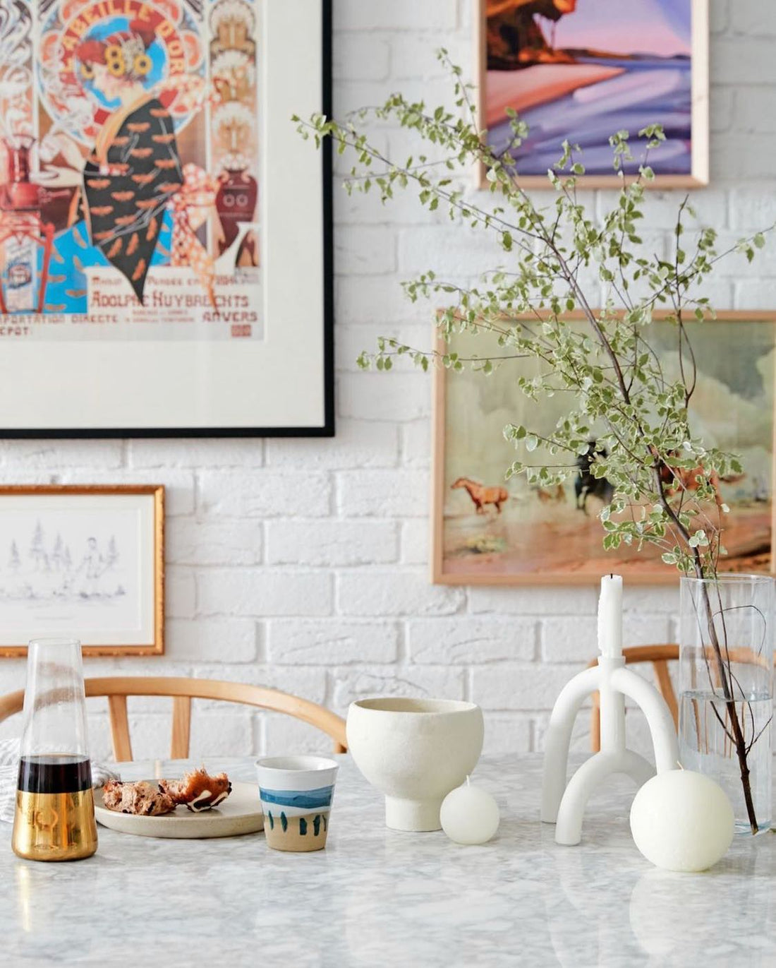
White
White is the quintessential base colour. Like a blank slate, an untouched canvas. White can make a room feel light and airy, and creates a sense of space. It combines well with all other colours and you literally cannot go wrong with white. When in doubt, choose white.
White often symbolises simplicity, purity and cleanliness. It gives space to all the other elements around it and gives them contrast to make them stand out. White provides a clean, neutral slate that keeps you from crowding your event too much.
"It’s there to give breathing room to other elements and to be a background to showcase something you want to bring more attention to.”
A stylist favourite, white is the perennial modern colour, and our pure white candles add a design touch to any setting.
Warm Minimalism
In keeping with one of the main interior trends of the year, we start with a look at the neutrals that make up Warm Minimalism, from off-whites including warm white and stone, to grey, clay and brown.
Warm Minimalism takes us from crisp, mostly white affairs into more cozy territory, combining warmer shades and natural textures to create a comforting sense of home. It moves on from sharp contrasts and focuses instead on a pared-back palette with smooth tonal transitions.
Stone
For a neutral tone with character, look no further than stone. An off-white with a hint of beige and grey, our Stone candles are loved by interior designs and event planners alike. Stone tones can add layers to a white decor, while not taking anything away from the white palette and still leaving space for accent colours.
 ( styling: The Small Things Co, photo: Anitra Wells )
Grey
On the cooler spectrum of the neutral shades, grey is almost always used as a secondary colour or accent. It is a subtle colour that can be used to temper or complement any colour or to serve as a quiet background. A cooler neutral that is both sophisticated and timeless.
 ( photo: Bodhi Living )
Clay
Another warm and earthy neutral, clay contains shades of sandstone and sienna red; colours that evoke an old-world charm, full of earthy energy. Clay goes great with natural furnishings, including exposed floors, wood furniture and leather upholstery, and pairs well with complementary tones like navy, graphite, and cream.
Brown
For a warmer and more earthy feel, brown is making a comeback as a natural neutral tone. As a earthy colour with strong associations with the natural world, we feel a sense of safety & security when surrounded by brown. In these uncertain times, there is a strong appeal for the cozy intimacy of mother nature, a desire to feel close to and comforted by the earth.
 ( A Los Angeles living room by Jake Arnold, photo: Michael Clifford )
According to Vogue, another factor that contributes to brown's appeal is the rise of warm minimalism.
"Shades of brown bring about warmth, earthiness, and calm that feel timeless and grounding”
Jake Arnold, principal of Studio Jake Arnold
A cozy alternative to the stark minimalism of all-white-everything, brown is a colour that’s comforting yet can still fit within a neutral, pared down palette beloved by minimalism devotees. It provides a lovely complement and base for other pops of colour in a space. Blue is a good colour to combine with brown because of the earth-water harmony, with brown representing either wood if it's dark & rich, or earth if it's light.
For earthy accents and warm & comforting spaces, brown is your new go-to neutral.
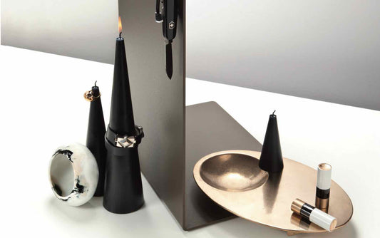
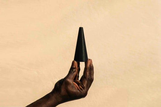
Black
And finally on the far end of the spectrum we find black. A powerful colour that can give focus to accent elements, but can also easily draw all the energy to itself depending on how it is applied. Black is often associated with sophistication and elegance, and used sparingly, black can help your space look polished and minimal.
 ( photo: Island Luxe )
It’s believed that black candles help to neutralise negativity, creating a calm, serene, and positive space. Black candles are also used for meditation, offering energy that grounds and protects us. Our black candles are timeless and sophisticated, and will give your space a minimal, design-driven look.
 ( Weatherboard cottage in Bowral, photo: Brigid Arnott )
Yellow
From creamy to warm to pale, yellow colours lift the spirit while providing warmth and comfort. Yellow adds optimism to your home, prompting feelings of happiness in all who enter.
The wide spectrum of yellow shades gives you flexibility in designing rooms with a feel-good ambiance. Muted yellow works well as a soothing neutral. A sun-kissed yellow brings the warmth of summer inside your home. A pale yellow can make a compact room feel larger.
 ( styling: Pia & Jade, photo: Alana Taylor )
As a calming hue that references the 70s, yellow can be considered a throwback to more relaxed times. Buttery yellow walls add a warm glow that makes a room feel cozy, while muted yellow walls can make a room feel peaceful. Considered to be a promise for brighter days, yellow can brighten up a space without overwhelming it.
"How wonderful yellow is. It stands for the sun."
Vincent van Gogh
Beloved for its irresistible and sunny disposition, yellow provides a playful highlight to any home's interior design style, no matter how it's used. An elegant & colourful candle, our Tusk in Pale Yellow adds a splash of spring to every setting and works wonders as a fresh accent colour.
 ( photo: Eleuthera Lennox Head )
Blue
Blue is calming, soothing and friendly. Full and soft, like an embrace or a deep breath. Beloved by ancient Chinese dynasties, the Moors and the Greeks, this enduring color takes some know-how to be used well. Most colours go well with blue, although introducing warmer shades, such as yellow, orange and red will add warmth to the scheme where it might otherwise be lacking.
Calm, cool and collected, the colour blue is a decorating win-win: not only does it make a beautiful base for a scheme but it’s scientifically proven to be a subconsciously calming shade, making you relax without even realising it.
You can always pair blue with white – doing so will create an elegant, restful room, especially with good natural daylight. Another colour to combine with blue is one from the range of neutrals and naturals – including brown and black. The one colour to avoid is grey, which can make a blue decor scheme feel cold.
 ( photo: Evolve Styling )
Green
Fresh, cool green can create a relaxing atmosphere in any room. Natural shades of green can help put us at ease in a new place. For this reason, designers often feature green in public spaces like restaurants and hotels.
Green is associated with nature, outdoors, growth & creativity, and as it is such an organic shade, it is very easy to live with. Researchers believe the positive association with green is hardwired in our brains from evolution: early humans knew that green in nature indicated a place where they could find food, water, and shelter.
Spending time in natural green environments or even looking at pictures of green scenery in nature has been linked to stress relief, better impulse control, and improved focus.
Toned down, green is a tranquil colour that can be really soothing and relaxing, but if it’s a super-vibrant green, it’s more refreshing and energetic. Our Tusk taper candle in Jade Green is eye-catching yet soothing, and pairs well with wood, white and matte black finishes.
Let your colours pop
So there's more to colour than meets the eye, but have some fun with it, experiment and don't overthink it. Especially when it comes to design objects like candles, if one colour doesn't work out you can simply light it and move on to the next.
Looking to add a pop of colour to your space?